
A Deep Dive into PyeCharts A Python Tool For Data Visualization
In the instance of analytics, data visualization is crucial because it permits users or clients to view large amounts of data and at the same time extract important insights that can drive the business forward. When we look into Pythonic methods, there are several options, such as Matplotlib, Seaborn, and others. Although, there are comparatively few points that have an interactive plot in a pythonic approach. In this blog, we can go through Pyecharts, a Python-based tool that can produce interactive plots in a variety of formats in a minimum number of lines of code. The important points to be discussed in this article and it is listed below
- About Data Visualization
- Python-based Tools for Visualization
- Data Visualization with PyeCharts
About Data Visualization
Using a map or graph you can practice putting information into a visual context because it will make it simpler for the human brain to absorb and extract insights from. The objective behind the data visualization is to make identifying patterns, trends, and outliers in a huge data set easier. The phrase is regularly used correspondingly with other words such as information graphics, information visualization, and statistical graphics.
Data Science technique is used in Data Visualization that asserts that after data has been collected, processed, and modelled, this is seen in order to draw conclusions. Moreover, Data visualization is a portion of a larger field known as DPA(Data presentation architecture), which aims to find, retrieve, alter, format, and transfer data as fast as possible.
For almost every operation Data visualization is necessary. To display test results teachers may use it, to improve AI(artificial intelligence) computer scientists can use it, for sharing information with stakeholders executives uses it. Also, large-scale data projects require it. Businesses demand a way to fastly and easily attain an overview of their data as they collect large volumes of data during the big data trend of the early years.
Python-based Tools for Visualization
In this portion, we will know more about the famous python-based tools used for data visualization.
Matplotlib
Python data visualization and 2-D plotting library are the Matplotlib. The Python community’s most popular and widely used plotting library is Matplotlib. It can be used on a variety of platforms because it comes with an interactive environment. Furthermore, In Python scripts, the Python and IPython shells, Jupyter notebooks, web application servers, and more, the Python library Matplotlib has been used.
To embed plots into applications, Tkinter, GTK+, wxPython, Qt, and other GUI toolkits can be used. Therefore, various types of charts are available so you can design plots, scatterplots, error charts, power spectra, stemplots bar, charts, pie charts, histograms, and any other visualization chart that you want with Matplotlib.
Seaborn
Seaborn is another Matplotlib-based Python data visualization framework. It is tightly linked with NumPy and pandas data structures. Seaborn recommends several dataset-oriented plotting routines that perform with arrays and data frames that contain entire datasets.
After that, it will implement the necessary statistical aggregation and mapping tasks on its own and it is for building the user’s desired informative visualizations. For studying and comprehending data, it is a high-level interface for visually attractive and convenient statistical visuals.
Plotly
Plotly is a free graphing library that can be used to create data visualizations. A web-based data visualization tool is Plotly(plotly.py) and it is built on top of the Plotly JavaScript library(plotly.js).
Besides, It is mainly used to create web-based data visualizations that can be shown in Jupyter notebooks or web applications using Dash or it can be saved as individual HTML files. There are different kinds of charts that are accessible in Plotly are Scatter plots, histograms, line charts, bar charts, pie charts, error bars, box plots, multiple axes, sparklines, dendrograms, 3-D charts.
Geoplotlib
Why Geoplotlib is such a useful Python library because most of the data visualization libraries don’t have much support for making maps or working with geographic data. It simplifies the creation of geographical maps in particular, with different types of map varieties such as dot-density maps, choropleths and symbol maps available.
We should keep in mind that installation requires Numpy and Pyglet, however, this is not a major drawback. Especially, the only excellent map-making option available is Geoplotlib if we want to make geographic maps.
Data Visualization with PyeCharts
In this portion, you will try to plot various kinds of charts using Pyecharts.
A class library that permits you to create an Echarts chart is known as Pyecharts.To know more about, a Baidu open-source data visualization JS library is Echarts. Also, It can generate attractive graphical visual effects, and also Pyecharts is docked with Python, making it suitable for using the data generation map directly in Python.
In your Jupyter Notebook, how you use visualization libraries in Python based on that Pyecharts performs. A Variety of configuration options are offered by Pyecharts, it permits you to fastly create the chart you want.
First of all, we need to install the library before starting. While we are looking for this tool, the code available in its official documentation works perfectly on a particular version of it. Some of the plots may not be available if we install directly without specifying the version.
Each and every chart that we will be creating here will get available as the HTML files in the local directory.
! pip install pyecharts==0.5.11
Please keep in mind that all the charts that we will be creating here we will get available as the HTML files in the local directory.
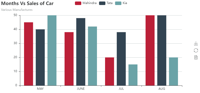
Bar Chart
In the below Bar chart we will plot a simple Multibar chart that displays sales of cars across different manufacturers.
from pyecharts import Bar
Barchart = Barchart(“Months Vs Sales of Car”, “Various Manufactures”)
Barchart.add(“Mahindra”, [‘MAY’,’JUNE’,’JUL’,’AUG’], [45,38,20,50], IS_MORE_UTILS = True)
Barchart.add(“Tata”, [‘MAY’,’JUNE’,’JUL’,’AUG’], [40,48,38,50], IS_MORE_UTILS = True)
Barchart.add(“Kia”, [‘MAY’,’JUNE’,’JUL’,’AUG’], [50,42,15,20], IS_MORE_UTILS = True)
Barchart.render(‘bar.html’) # Generates a Barchart.html file in the specified directory
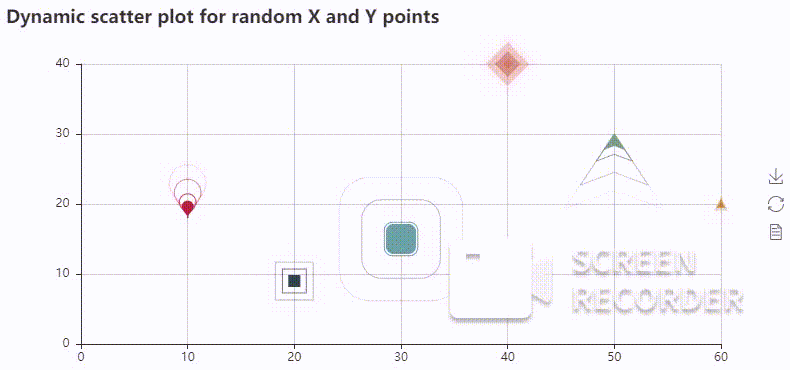
Dynamic Scatter Chart
The scatter plots are very well designed and more understandable, here the dynamic scatters plot is nothing however we have added some additional animation with distinct points with distinct symbolic representation.
from pyecharts import EffectScatter
effs =EffectScatter(“Dynamic scatter plot for random X and Y points”)
effs.add(“”, [10], [18], symbol_size=20, effect_scale=3.5, effect_period=3, symbol=”pin”)
effs.add(“”, [20], [9], symbol_size=12, effect_scale=4.5, effect_period=4,symbol=”rect”)
effs.add(“”, [30], [15], symbol_size=30, effect_scale=5.5, effect_period=5,symbol=”roundRect”)
effs.add(“”, [40], [40], symbol_size=10, effect_scale=6.5, effect_brushtype=’fill’,symbol=”diamond”)
effs.add(“”, [50], [30], symbol_size=16, effect_scale=5.5, effect_period=3,symbol=”arrow”)
effs.add(“”, [60], [20], symbol_size=6, effect_scale=2.5, effect_period=3,symbol=”triangle”)
effs.render(‘Scatter.html’).
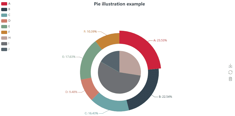
Nested Pie Chart
In the Nested Pie Chart, you will plot a nested version of the Pie plot and which is pretty easy to plot. You just want to add labels further and values by using the .add method and by specifying the radius carefully.
from pyecharts import Pie
pie =Pie(“Pie illustration example”, title_pos=’center’, width=1000, height=600)
pie.add(“”, [‘A’, ‘B’, ‘C’, ‘D’, ‘E’, ‘F’], [335, 321, 234, 135, 251, 148], radius=[40, 55],is_label_show=True)
pie.add(“”, [‘H’, ‘I’, ‘J’], [335, 679, 204], radius=[0, 30], legend_orient=’vertical’, legend_pos=’left’)
pie.render(‘nested pie.html’)
Liquid Level Chart
The liquid plot is one of the plots which you have found only in this framework, and plotting it very easy just takes 3 lines. Animation of the plot does satisfy its name.
from pyecharts import Liquid
liquid =Liquid(“Waterlevel indication”)
liquid.add(“Liquid”, [0.7328])
liquid.render(‘water_ball.html’)

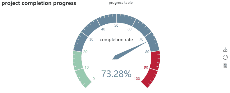
Gauge Chart
We have seen different types of analogue meters or processing meters, PyeCharts does deliver it under the Guage plot as shown below.
from pyecharts import Gauge
gauge = Gauge(‘project completion progress’)
gauge.add(‘progress table’, ‘completion rate’ , 73.28)
gauge.render(‘Gauge.html’)
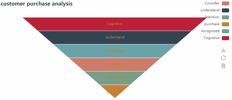
Funnel Chart
The purpose of the funnel chart is to show the chronological events, ascending or descending numbers. PyeChart example of funnel chart as shown below.
from pyecharts import Funnel
Attr = [‘Cognitive ‘,’ understand ‘,’ recognized ‘,’ Consider ‘,’ intention ‘,’ purchase ‘]
value = [120, 100, 80, 60, 40, 20]
Funnel = Funnel(‘customer purchase analysis’)
Funnel.add(‘Cloth Purchase’, Attr, value, is_label_show = True, label_pos = ‘inside’, legend_orient=’vertical’, legend_pos=’right’,label_text_color = ‘# fff’)
Funnel.render(‘Funnel.html’) # Generates files in the specified directory
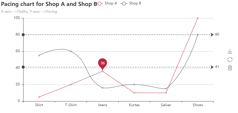
Line Chart
The main usage of line chart is to show the details as a series of data points connected by a line. Below is an example of a line chart.
from pyecharts import Line
attr =[“Shirt”, “T-Shirt”, “Jeans”, “Kurtas”, “Salwar”, “Shoes”]
v1 =[5, 20, 36, 10, 10, 100]
v2 =[55, 60, 16, 20, 15, 80]
line =Line(“Pacing chart for Shop A and Shop B”,”X-axis–>Cloths, Y-axis–>Pricing”)
line.add(“Shop A”, attr, v1, mark_point=[“average”])
line.add(“Shop B”, attr, v2, is_smooth=True, mark_line=[“max”, “average”])
line.render(‘poly_line.html’)
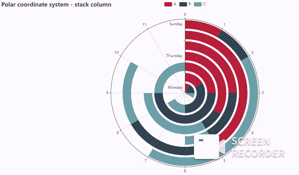
Polar Chart
The polar chart is a circular chart that shows information as polar coordinates using values and angles. Polar charts have been used for displaying scientific data. Below is an example of a Polar Chart.
from pyecharts import Polar
Radius_ =[‘Monday_’,’Tuesday_’,’Wednesday_’,’Thursday_’,’Friday_’,’Saturday_’,’Sunday_’]
po =Polar(“Polar_coordinate_system_”, width=1200, height=600)
po.add(“A”, [1, 2, 3, 4, 3, 5, 1], radius_data=Radius_, type=’barRadius’, is_stack=True)
po.add(“B”, [2, 4, 6, 1, 2, 3, 1], radius_data=Radius_, type=’barRadius’, is_stack=True)
po.add(“C”, [1, 2, 3, 4, 1, 2, 5], radius_data=Radius_, type=’barRadius’, is_stack=True)
po.render(‘polar_test.html’)
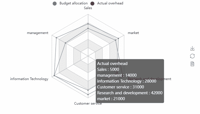
Radar Chart
A two-dimensional graphical representation of multivariate data with three or more quantitative variables represented on axes that start at the same point is known as Radar chart. Below is an example of a Radar Plot.
from pyecharts import Radar
schema =[ (“Sales”, 6500), (“management”, 16000), (“information Technology”, 30000), (“Customer service”, 38000), (“Research and development”, 52000), (“market”, 25000)]
v1 =[[4300, 10000, 28000, 35000, 50000, 19000]]
v2 =[[5000, 14000, 28000, 31000, 42000, 21000]]
radar =Radar()
radar.config(schema)
radar.add(“Budget allocation”, v1, is_splitline=True, is_axisline_show=True)
radar.add(“Actual overhead”, v2, label_color=[“#4e79a7”], is_area_show=False)
radar.render(‘rader_test.html’)
Conclusion
In this blog, you can be seen the purpose and the importance of data visualization. After that, we have gone through some of the widely used Python-based visualization tools. Finally, we can see the Pyecharts package in Python practically. The charts created using these package are dynamic, thus the numbers appear with the transparent background at any moment when the mouse hovers over them. The graphs that are built are very attractive. When we are using this package less coding only is required to create pleasing charts. There is also help for the Creative theme palette with PyeCharts.